This is a scatterplot of the relationship between perceived social class and generosity.

More information
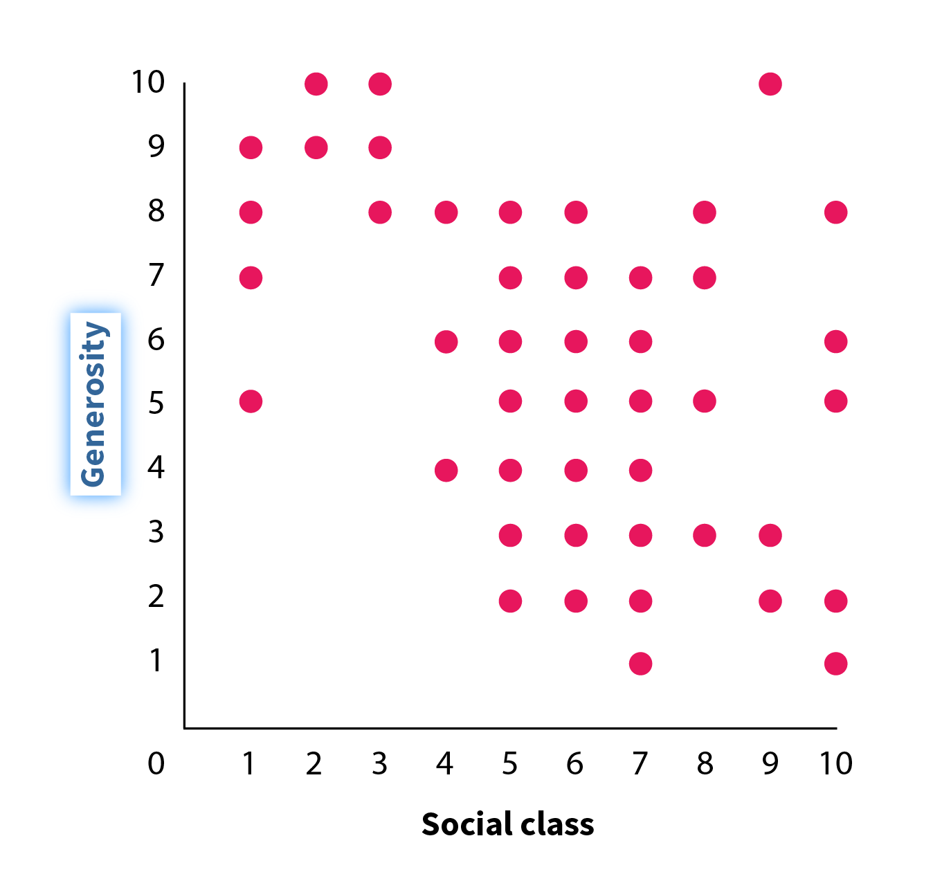
The y-axis represents generosity, and the x-axis represents social class. Both the axes range from 0 to 10, in increments of 1. Data points are scattered in a downward pattern from the top left to the bottom right of the graph.

More information
The y-axis represents generosity, and the x-axis represents social class. Both the axes range from 0 to 10, in increments of 1. Data points are scattered in a downward pattern from the top left to the bottom right of the graph. The label on the x-axis highlighted.
More information
The y-axis represents generosity, and the x-axis represents social class. Both the axes range from 0 to 10, in increments of 1. Data points are scattered in a downward pattern from the top left to the bottom right of the graph. The label on the y-axis is highlighted.
More information
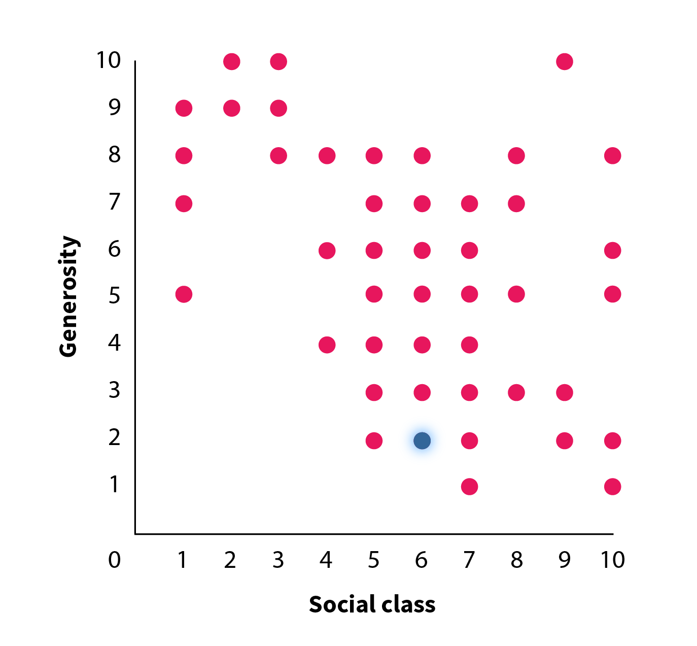
The y-axis represents generosity, and the x-axis represents social class. Both the axes range from 0 to 10, in increments of 1. Data points are scattered in a downward pattern from the top left to the bottom right of the graph. One of the data points is highlighted, representing a participant who was rated a 6 in social class and a 2 in generosity.
More information
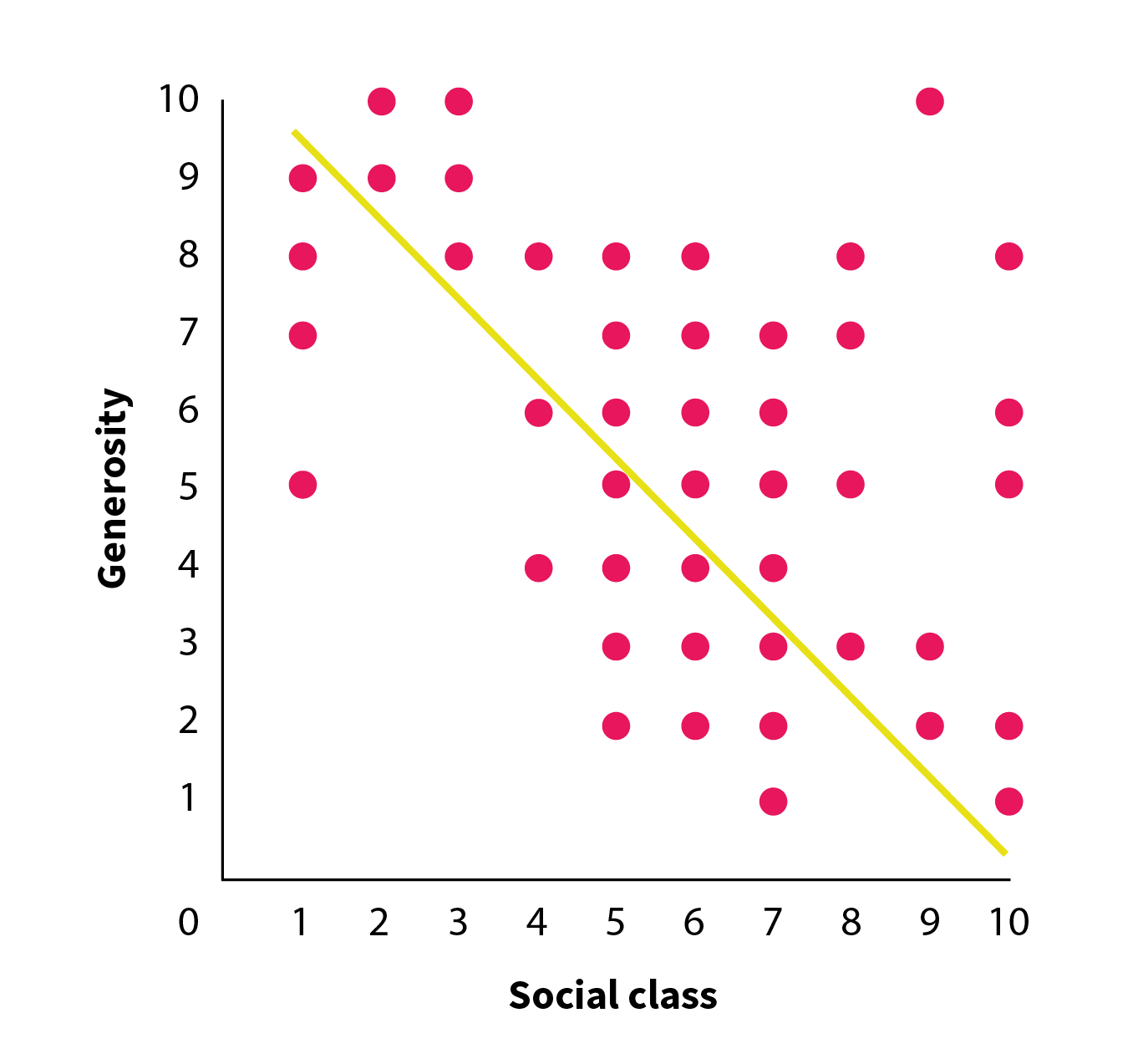
The y-axis represents generosity, and the x-axis represents social class. Both the axes range from 0 to 10, in increments of 1. Data points are scattered in a downward pattern from the top left to the bottom right of the graph. A line is drawn diagonally from the top left to the bottom right of the graph, emphasizing the pattern of results.
More information
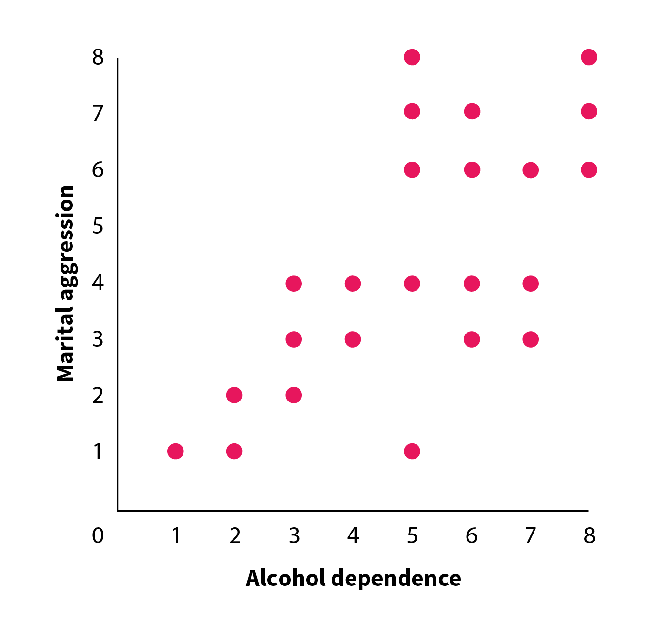
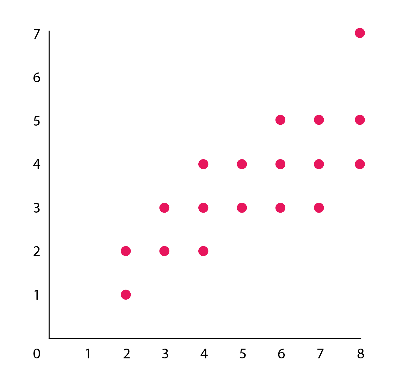
The y-axis represents marital aggression, and the x-axis represents alcohol dependence. Both the axes range from 0 to 8, in increments of 1. Data points are scattered in an upward pattern from the bottom left to the top right of the graph.
More information
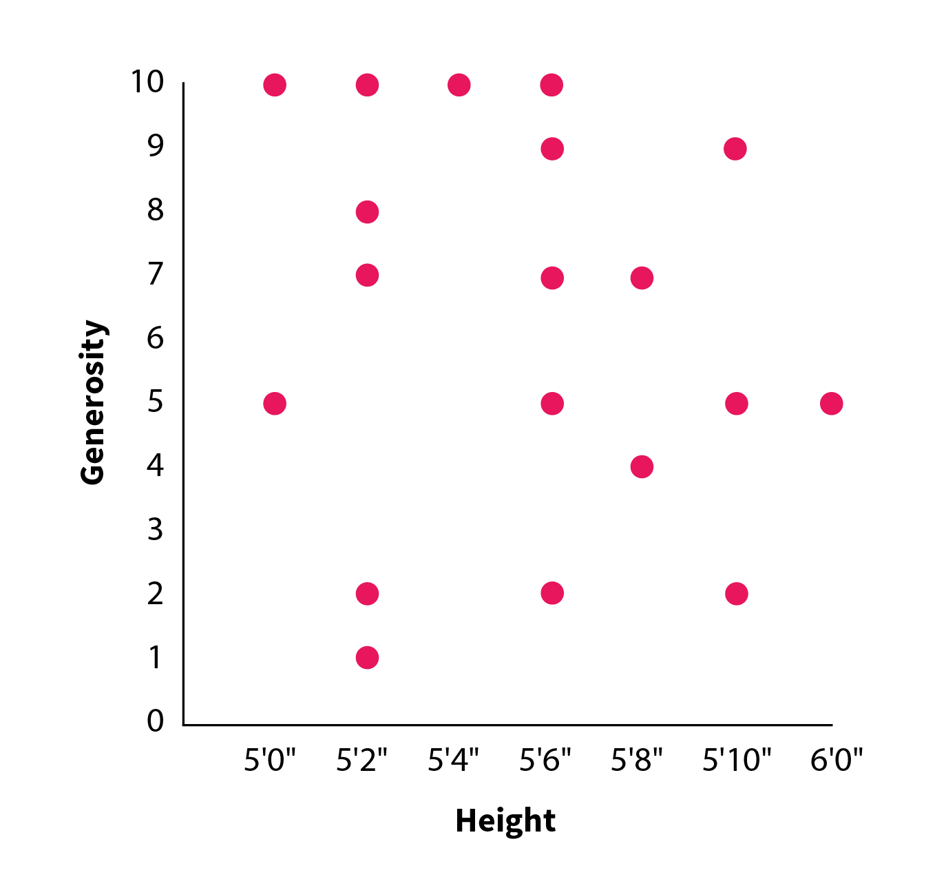
The y-axis represents generosity, and the x-axis represents height. The y-axis ranges from 0 to 10, in increments of 1. The x-axis ranges from 5 feet to 6 feet, in increments of 2 inches. Data points are scattered randomly throughout.

More information
The y-axis represents generosity, and the x-axis represents social class. Both the axes range from 0 to 10, in increments of 1. The data points start in the top left of the graph and move uniformly in a downward diagonal direction.
More information
The y-axis represents generosity, and the x-axis represents social class. Both the axes range from 0 to 10, in increments of 1. The data points start in the bottom left of the graph and move uniformly in an upward diagonal direction.
More information
The y-axis represents generosity, and the x-axis represents social class. Both the axes range from 0 to 10, in increments of 1. Data points are scattered in a downward pattern from the top left to the bottom right of the graph.
More information
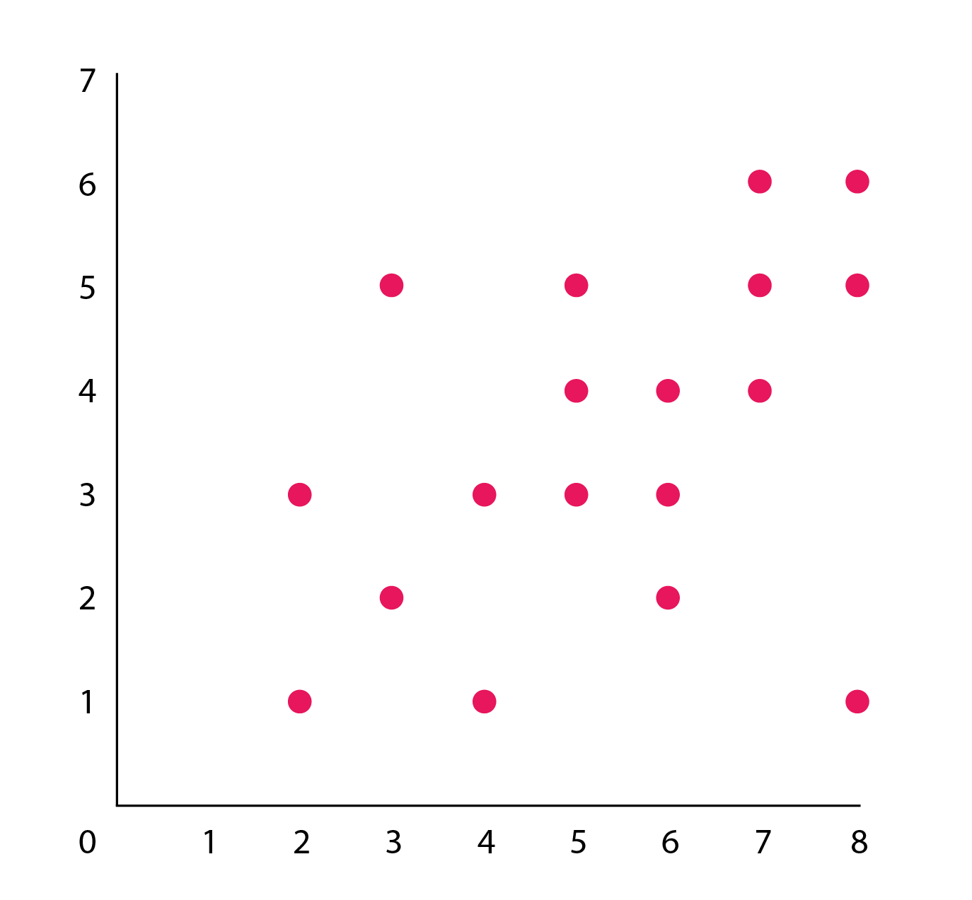
The y-axis represents generosity, and the x-axis represents social class. Both the axes range from 0 to 10, in increments of 1. Data points are scattered in an upward pattern from the bottom left to the top right of the graph.

More information
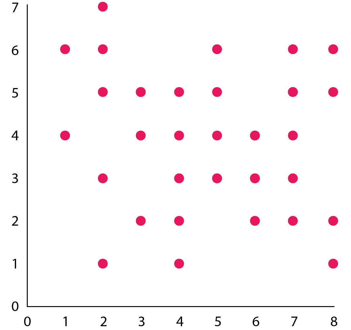
The y-axis represents generosity, and the x-axis represents social class. Both the axes range from 0 to 10, in increments of 1. Data points are scattered randomly throughout.
In this example, the variable along the x-axis is perceived social class, or how high or low each participant thought he or she ranked in social class, from least (1) to most (10) wealthy.
The variable along the y-axis is generosity. Generosity is represented by how often a participant attempted to help a stranger in a cooperative game, from least (1) to most (10) generous.
Each dot represents where a particular participant fell on both the y-axis and the x-axis. This particular dot represents a participant who was rated a 6 in social class and a 2 in generosity.
Viewing a scatterplot can give you an indication of the pattern of results. Notice here how the cloud of points goes down as it moves from left to right. This is a negative correlation: high scores on one variable go with low scores on the other.
This scatterplot shows the relationship between alcohol dependence and marital aggression. The slope of the data points goes up from left to right. This is a positive correlation: as one variable increases, so does the other.
This scatterplot shows the relationship between height and generosity. Here the data points have no apparent pattern, so we say that the graph represents no or zero correlation between the two variables.
Select each button below to see what correlations with different strengths and directions might look like on a scatterplot.